
Back
Fusion Design System
Desktop, Tablet and Mobile
Values


Fusion is built to bring people together. Ensuring our products are as accessible as possible, for any context or range of ability, temporary or permanent. Our system should be built to be as inclusive as possible, increasing confidence to contribute to the team next door or on the other side of the world. The system itself should be as open as possible, for teams to discover, access, understand, contribute to and share work wherever appropriate. We encourage inclusion, accessibility, openness and connect people to each other and their work.
Our products should be individually fit-for-purpose as well as collectively harmonious. They should carry a persistent visual and behavioural similarity and adapt to different devices and contexts, rather than being consistent for the sake of consistency.
We manage the expectation that learned behaviours will carry across products, with the need to adapt appearance and functionality to be more effective.
Each piece is part of a greater whole and should contribute positively to the system at scale. Consistency of style and behavoiur in the system is paramount.
Fusion will be used around the world by a wide global community. Our products and visual language should be welcoming and accessible.
A design system logo encapsulates brand identity with consistency and adaptability. It serves as a cohesive visual element, ensuring recognizability and seamless application across products, reinforcing the brand's core principles.
Fusion respects the work people need to get done, and knows when to advise and when to get out of the way. It considers the progress we have already made in certain areas, offers better ways to work, draws connections between different stages of work (design, specs, issues and front-end code). It should celebrate what’s done, nudge action on tasks as needed.
Fusion should be considering our journey as a whole and anticipating our next steps as a company.
Connect people to collaborate better
Match purpose and feel familiar
Unified
Universal
Drive momentum from end to end
Goals
Values
Logo Design

A color palette is a curated selection of colors used in design to create a cohesive, visually appealing aesthetic. It establishes brand identity, evokes specific emotions, and guides user interaction. Palettes typically include primary, secondary, and accent colors, ensuring consistency across products or media. Thoughtful use of color enhances usability and reinforces visual harmony.
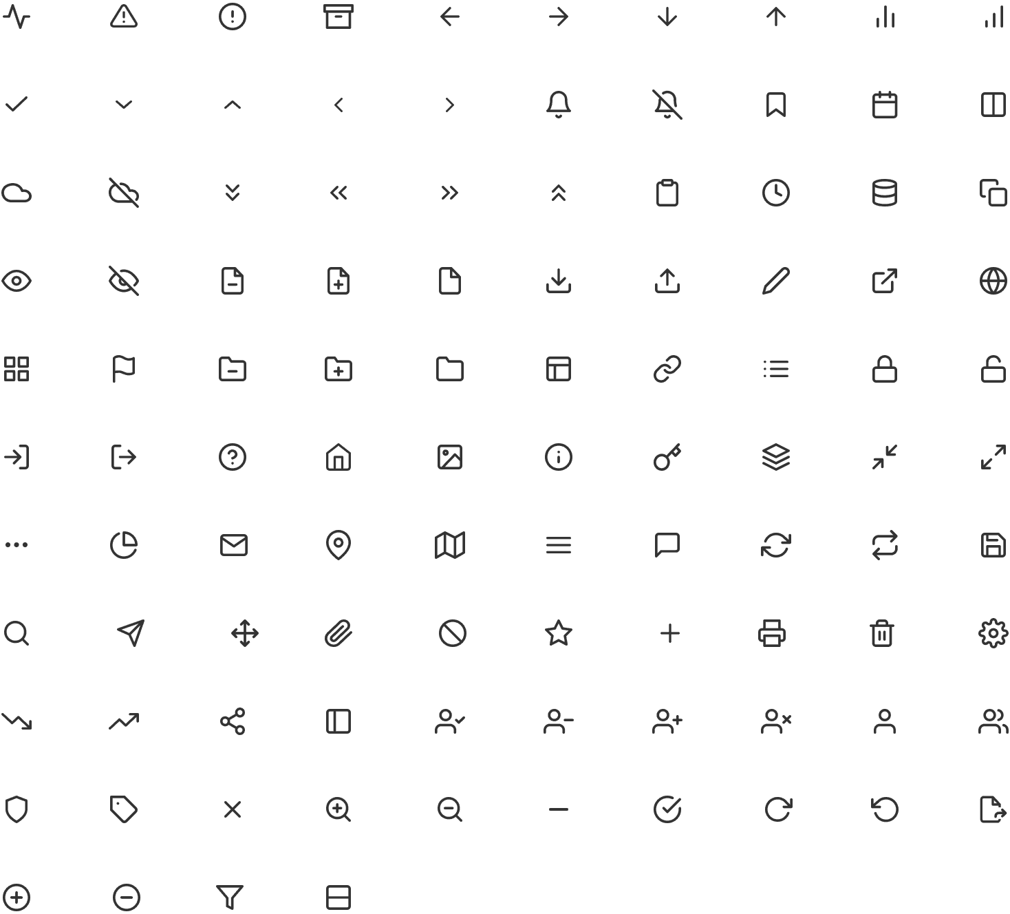
Icons are images or symbols that represent specific actins or tools in an interface. To achieve harmony for an icon family, we need to maintain the same stylistic rules through out, 1.5 px centred stroke and grid for 24 X 24
Typography is part of the overall visual language you use to communicate with your users. Just like the visual elements of color, from and pattern, typography can set a mood, set a tone and present a product the way you want it preceived.
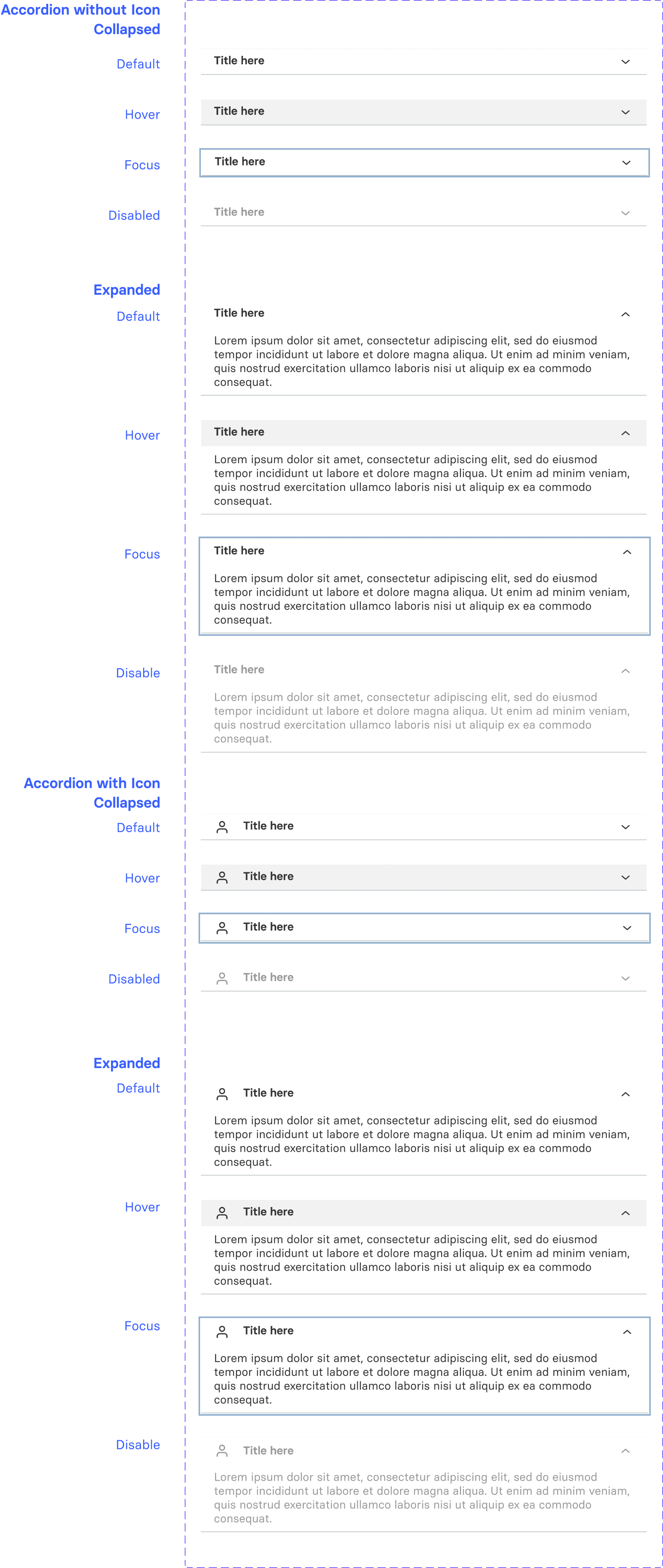
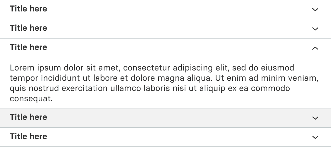
The accordion component in a design system organizes content in expandable sections, keeping interfaces clean and intuitive. It supports user-friendly layouts, helping users access information efficiently without overwhelming the visual space.
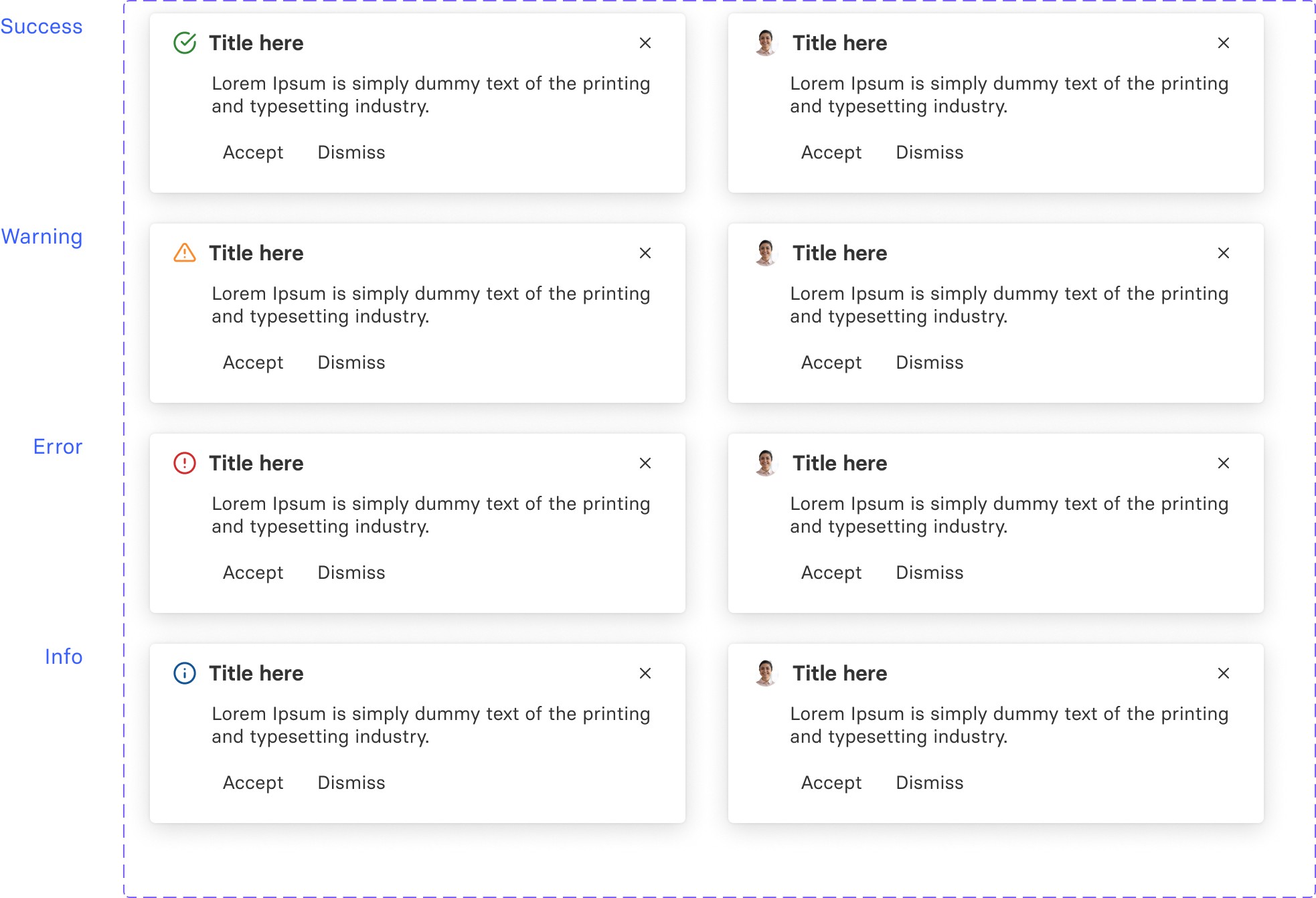
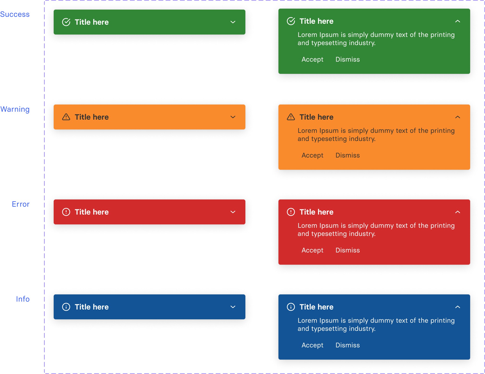
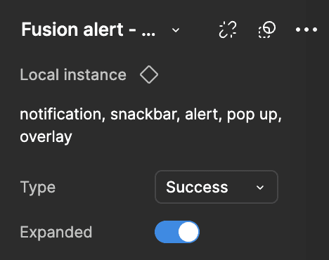
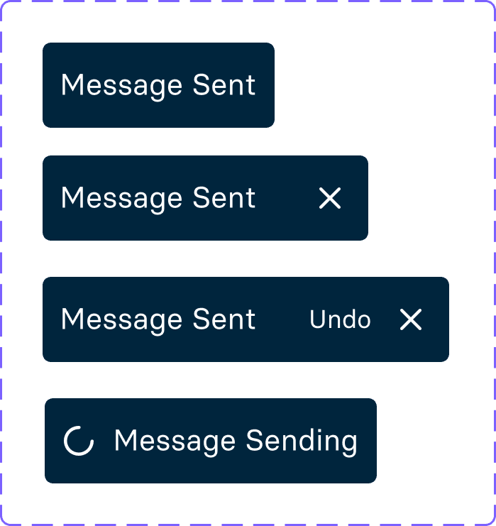
A system alert is a notification triggered to inform users of important events or issues within a system. Alerts can indicate errors, warnings, or updates, guiding users to take action or stay informed. They’re often displayed as pop-ups or banners, ensuring visibility and quick response to critical information.
An avatar is a visual representation of a user, often shown as an image, icon, or character, in digital platforms and apps. Avatars personalize user profiles, making interactions feel more engaging and relatable. They can reflect a user's appearance, personality, or preferences, fostering connection within digital environments.
A paginator divides content into pages for easier navigation, improving user experience. It usually includes "Previous" and "Next" buttons, along with page numbers, allowing users to efficiently browse large datasets without overwhelming them with excessive information at once.
A banner is a prominent UI element, often displayed at the top of a page or section, used to communicate key information or announcements. Banners can highlight updates, promotions, warnings, or other important messages, catching users' attention quickly. They help guide user actions or provide essential context.
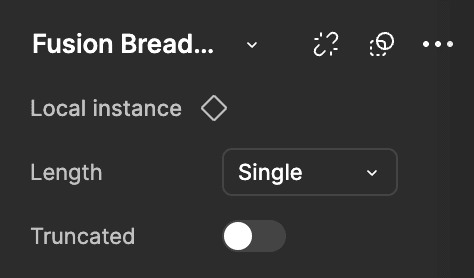
A breadcrumb is a navigational aid that displays a trail of links, showing users their path within a website. It improves navigation, helping users understand their location and return to previous pages.
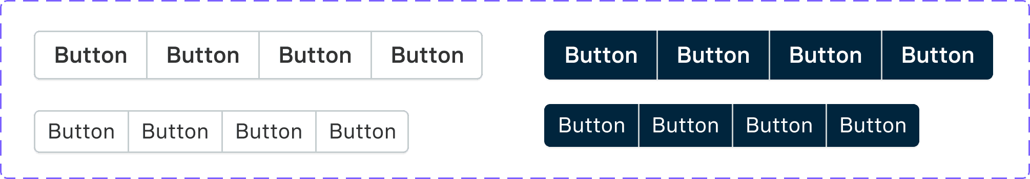
Buttons are interactive UI elements that prompt user actions, like submitting forms or navigating pages. Styled for visibility, they enhance usability by providing clear, clickable commands, improving user experience and engagement.
A button group is a UI component that organizes multiple buttons together, offering users choices or actions in a compact layout. It helps streamline navigation and maintain a clean interface.
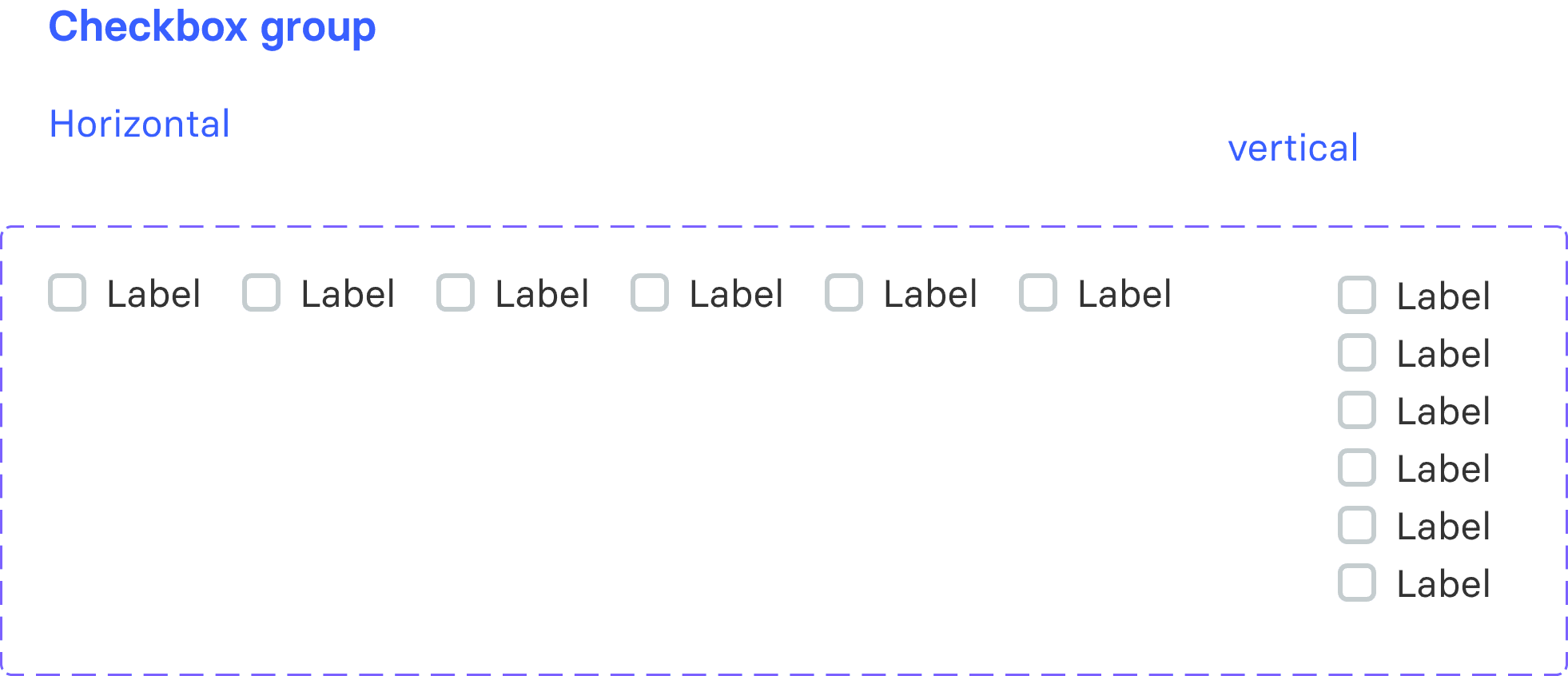
A checkbox is a UI element that allows users to select one or multiple options from a list. It provides a simple way to toggle choices, enhancing flexibility in form inputs.
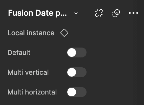
A date picker is a UI component that enables users to select dates from a calendar interface, simplifying date input and reducing errors. Often used in forms, it helps users easily choose dates for bookings, scheduling, and other time-based actions.
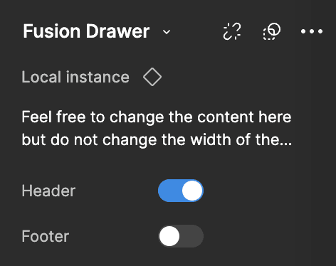
A drawer is a sliding panel in a UI that provides access to additional content or navigation options without leaving the main screen. It’s commonly used for menus and quick settings.
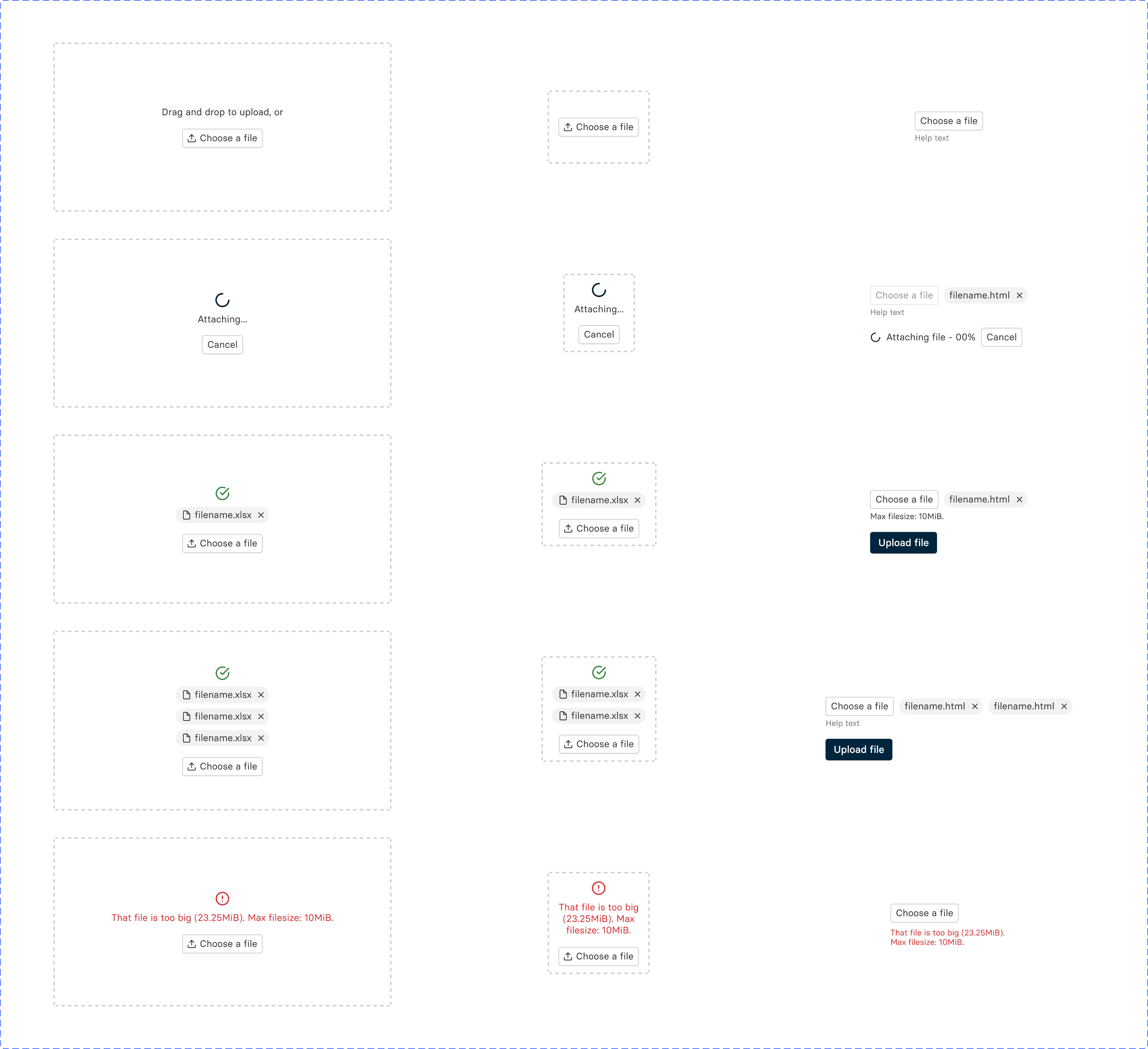
A file upload component allows users to select and upload files from their device to an application or website. It supports various file types and often includes features like drag-and-drop, progress indicators, and file previews, making file management straightforward and user-friendly.
A flyout is a UI component that temporarily appears on the screen, often in response to user interaction (like clicking a button or hovering). It provides additional information, options, or actions without navigating away from the main content, helping users access quick details or settings.


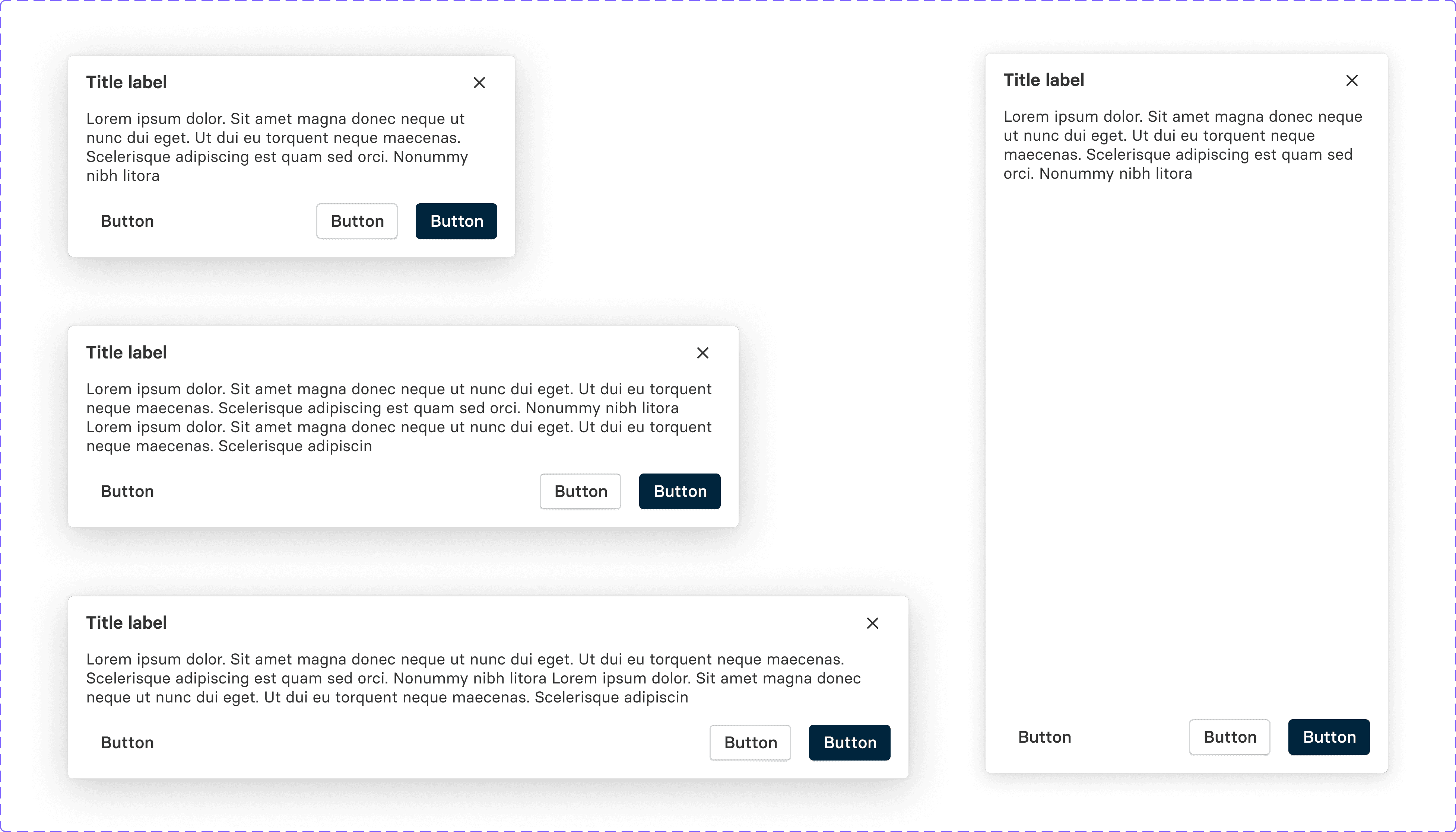
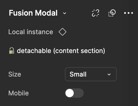
A modal is a UI component that appears as a focused, overlaying window, prompting users to take action or view critical information without navigating away from the current screen. Modals are commonly used for confirmations, forms, alerts, or displaying additional content in a contained manner, ensuring user attention on the task at hand.
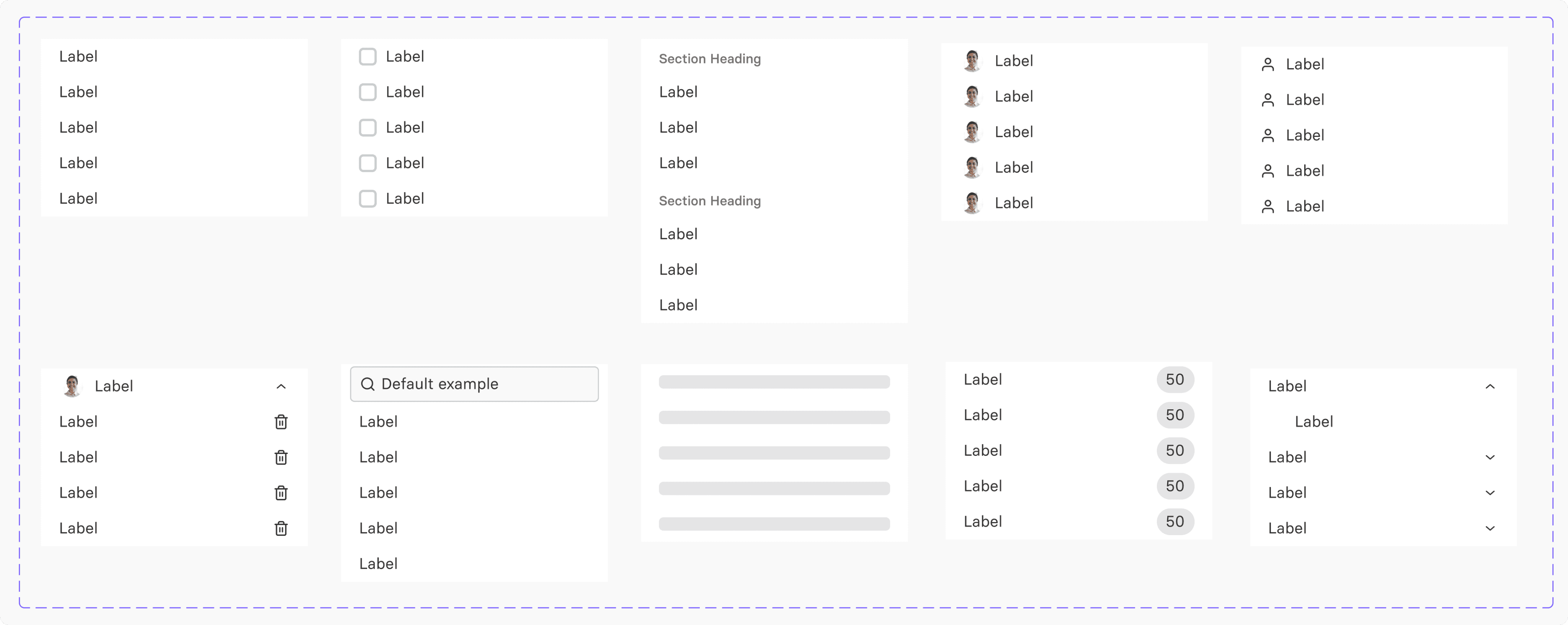
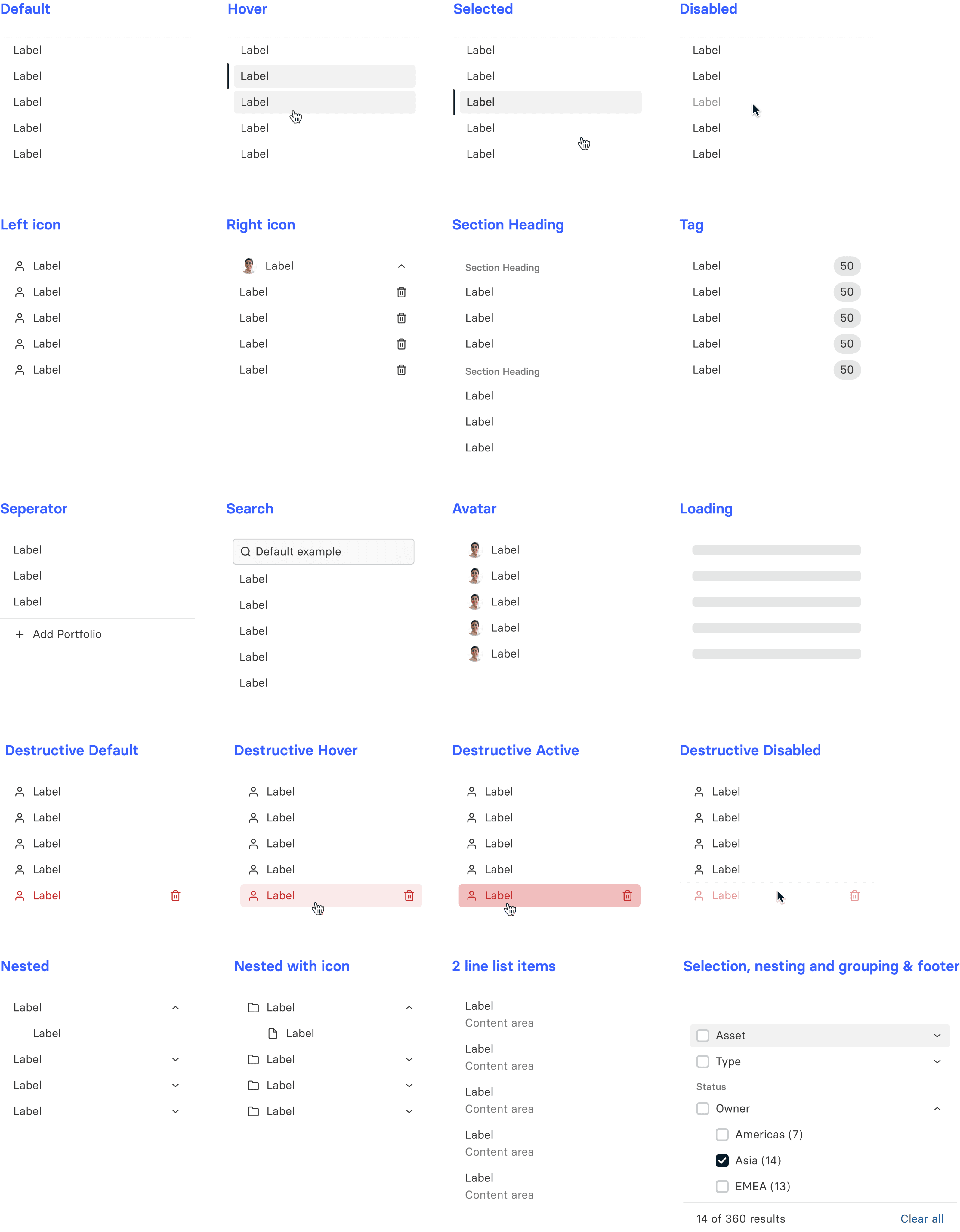
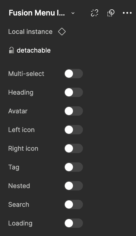
A menu list is a UI component that displays a list of navigation options or actions for users to choose from. It helps organize content, providing quick access to different sections or functions within an application. Menu lists are often used in navigation bars, dropdowns, and side panels, improving usability and guiding users through an interface.
A navigation bar (nav bar) is a UI component that provides users with quick access to key sections or features within an application or website. Typically located at the top or side of the interface, it includes links or icons to navigate between pages, making it easier for users to find content and enhancing overall user experience.
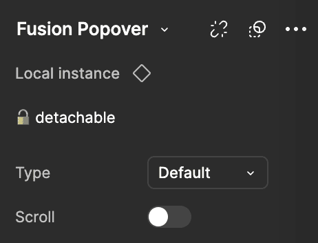
A popover is a small, temporary UI element that displays additional information or actions related to a specific part of the interface. It appears when users click or hover over a target element, like a button or icon, without disrupting the main content. Popovers are useful for providing contextual help, options, or details, enhancing interactivity and user guidance.
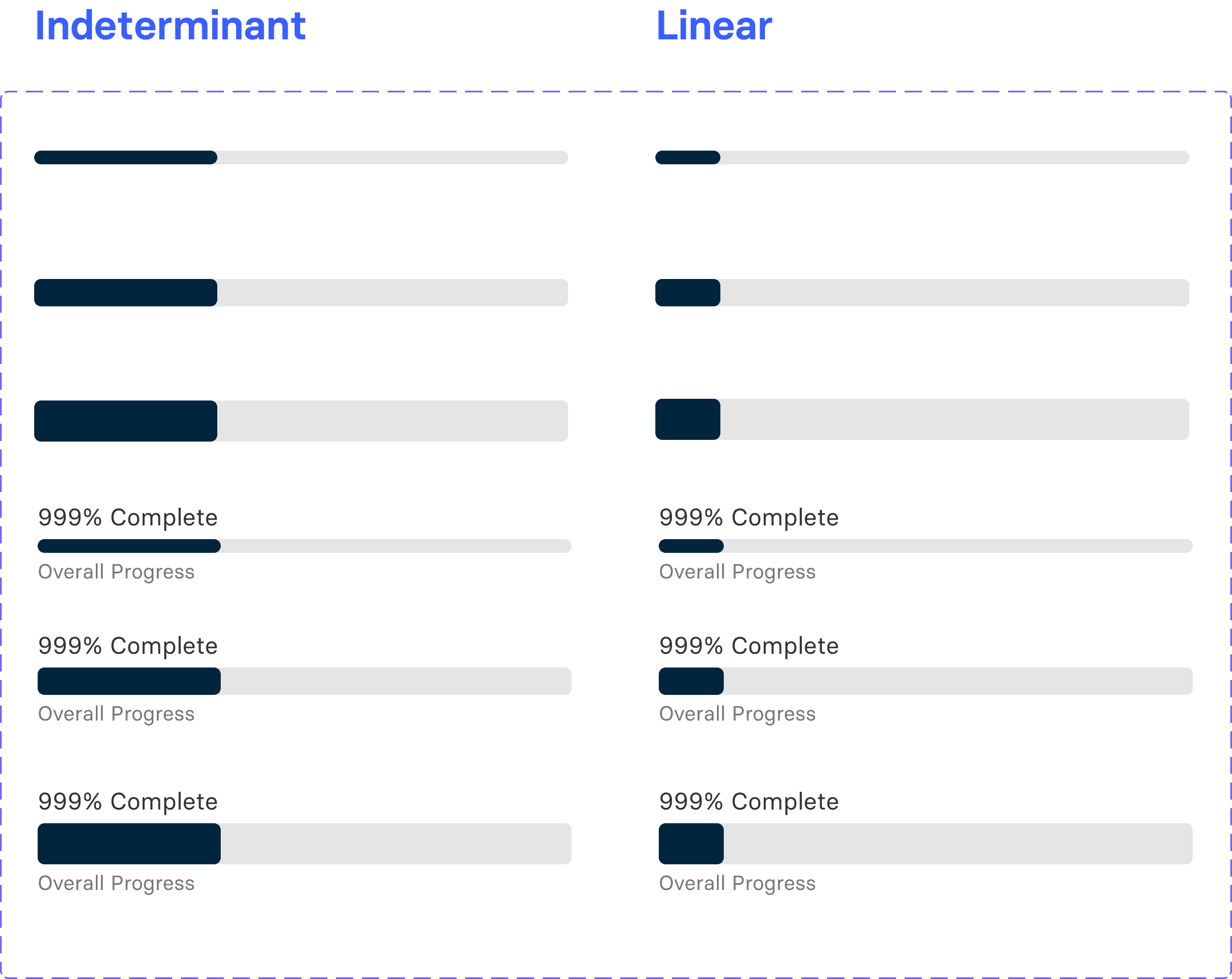
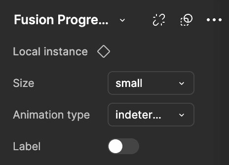
A progress bar is a UI element showing task completion visually. As the bar fills, it indicates progress, helping users track status and manage expectations for actions like loading or uploads. Progress bars improve user experience by providing feedback on the current state and time remaining for the task.
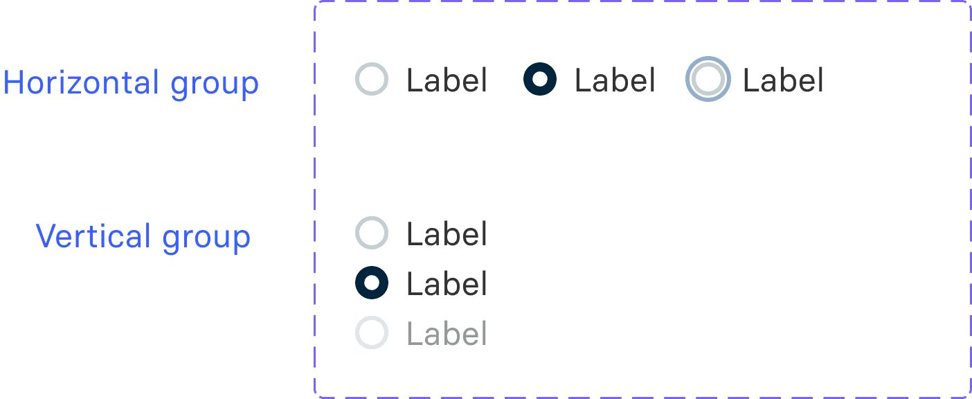
A radio button is a UI component that allows users to select only one option from a set of choices. Presented as small circles, radio buttons are often used in forms to make single-choice selections clear and straightforward, enhancing user input accuracy.
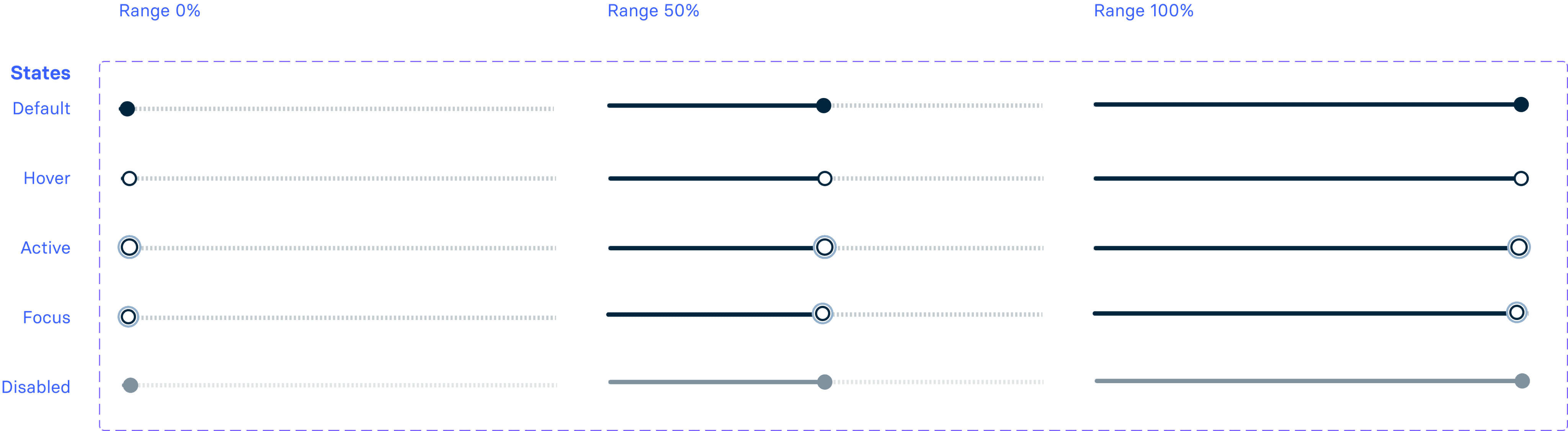
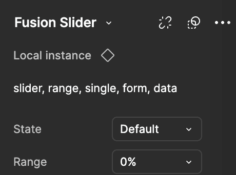
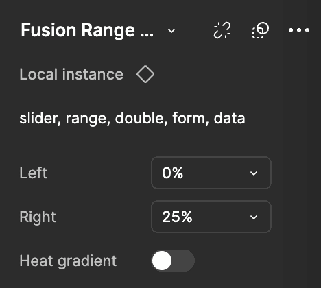
A slider is a UI component that lets users adjust a value or select a range by dragging a handle along a track. Often used for settings like volume, brightness, or price range, sliders provide an intuitive, interactive way to make selections within a defined scale.

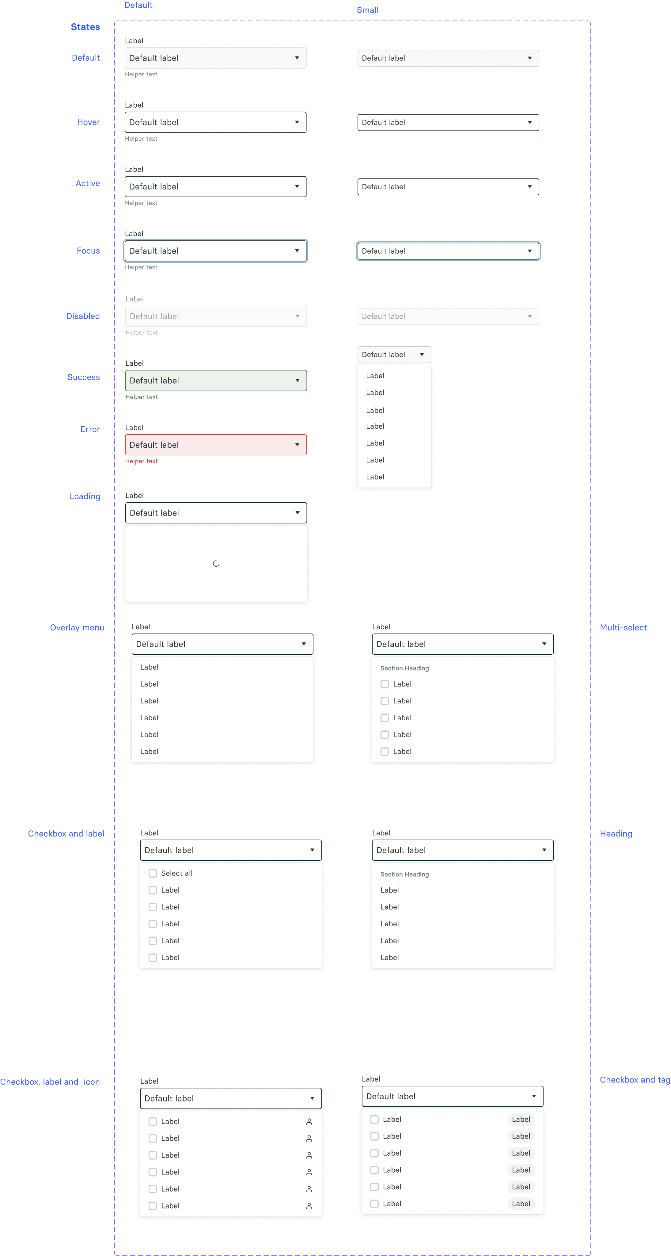
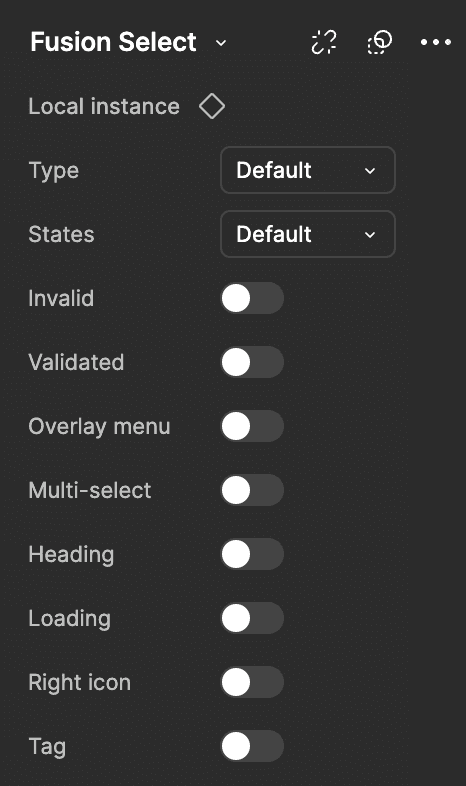
A select component is a UI element that enables users to choose one or more options from a dropdown list. It simplifies complex choice-making by presenting options in a compact, organized way, conserving screen space and enhancing usability in forms or settings.
A side panel is a UI component that slides in from the side of the screen, displaying additional information, settings, or navigation options without leaving the main view. Often used for menus, filters, or quick actions, side panels keep the main content accessible while providing extra functionality in an organized, space-saving manner.
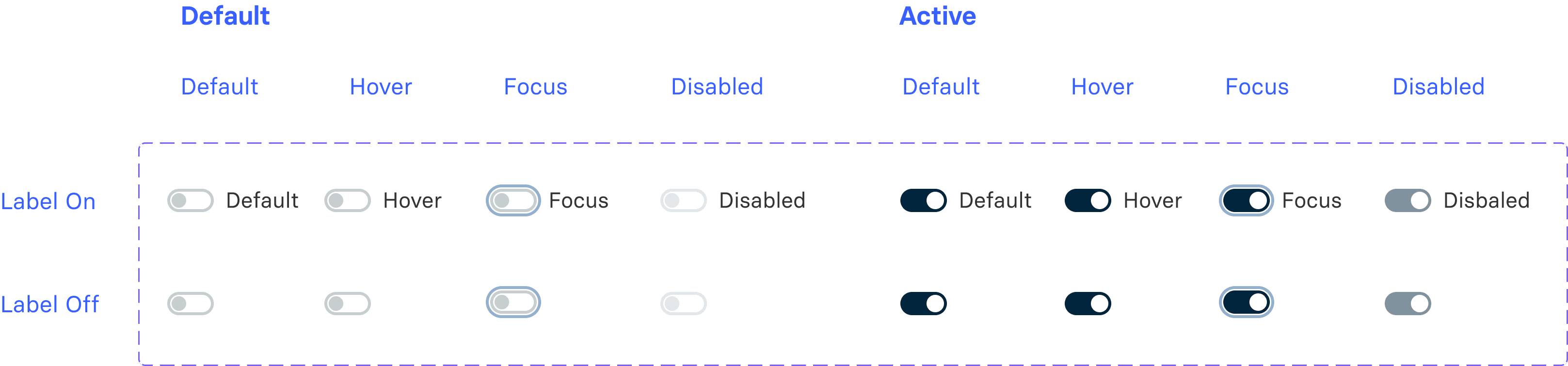
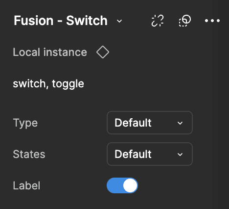
A switch is a UI component that allows users to toggle between two states, such as on/off or enable/disable. Resembling a physical switch, it provides a quick, intuitive way to control settings or activate features, improving user interaction by making options immediately clear.
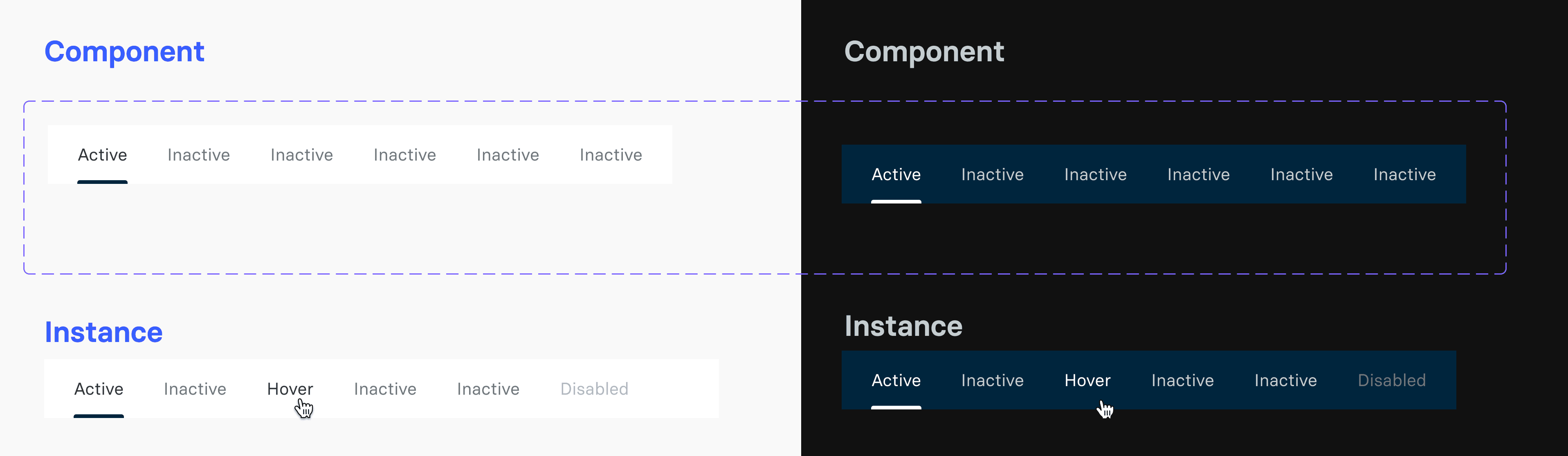
A tab is a UI component that organizes content into multiple sections or views within the same interface. Tabs allow users to navigate between related content areas without switching screens, creating a more streamlined experience. They’re commonly used in apps and websites to keep information accessible and well-organized.
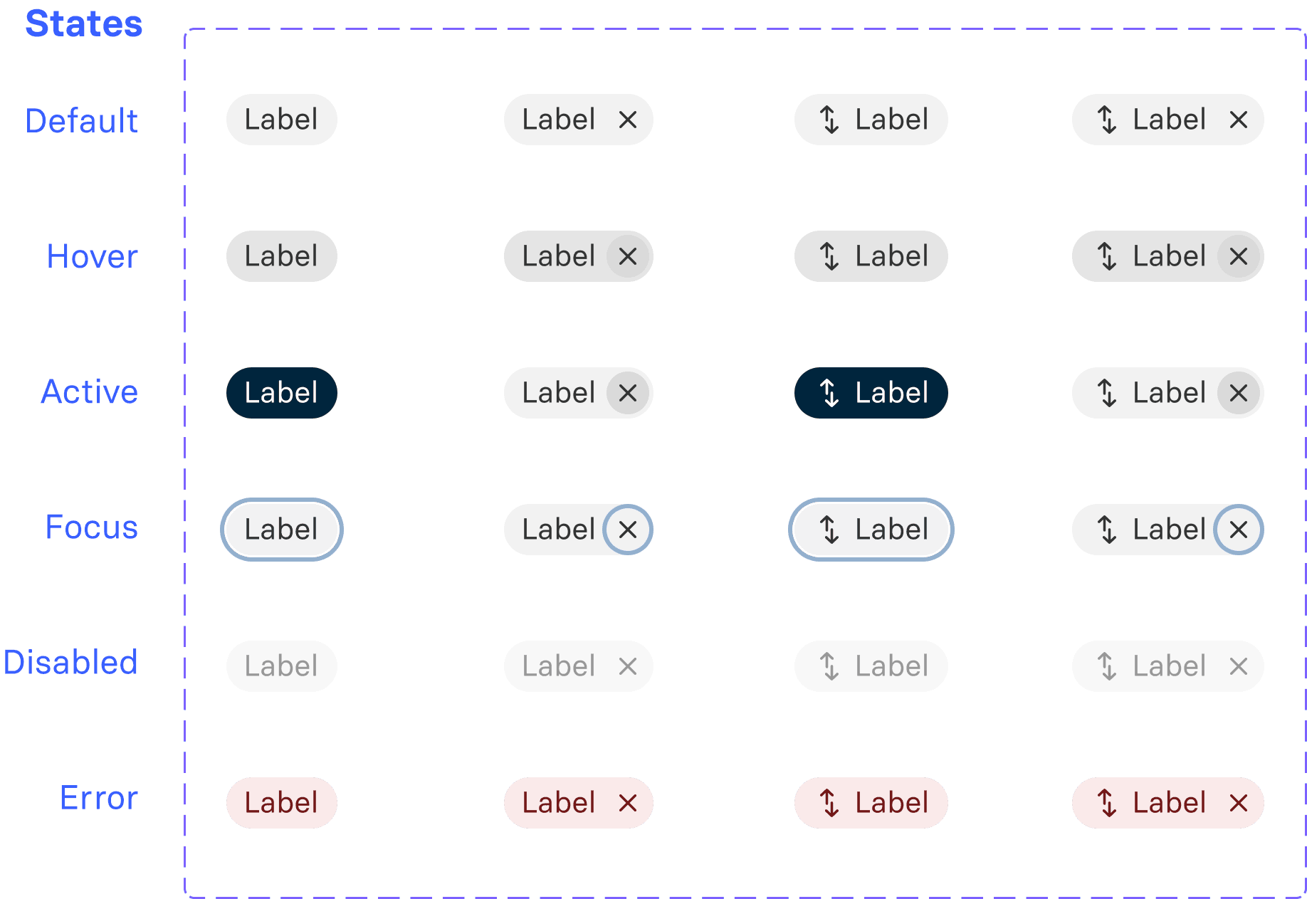
A tag is a UI element that labels or categorizes items with brief, descriptive text. Often used to highlight attributes like status, keywords, or categories, tags help users quickly understand or filter content. They improve organization, aid in content discovery, and enhance navigation within an interface.
A text area is a UI component that allows users to input multiple lines of text, often used for comments, descriptions, or messages. It provides a larger input field than standard text boxes.
A tooltip is a small, temporary UI element that appears when users hover over or focus on an item. It provides brief, contextual information or guidance, enhancing usability without cluttering the interface.

A tooltip is a small, temporary UI element that appears when users hover over or focus on an item. It provides brief, contextual information or guidance, enhancing usability without cluttering the interface.
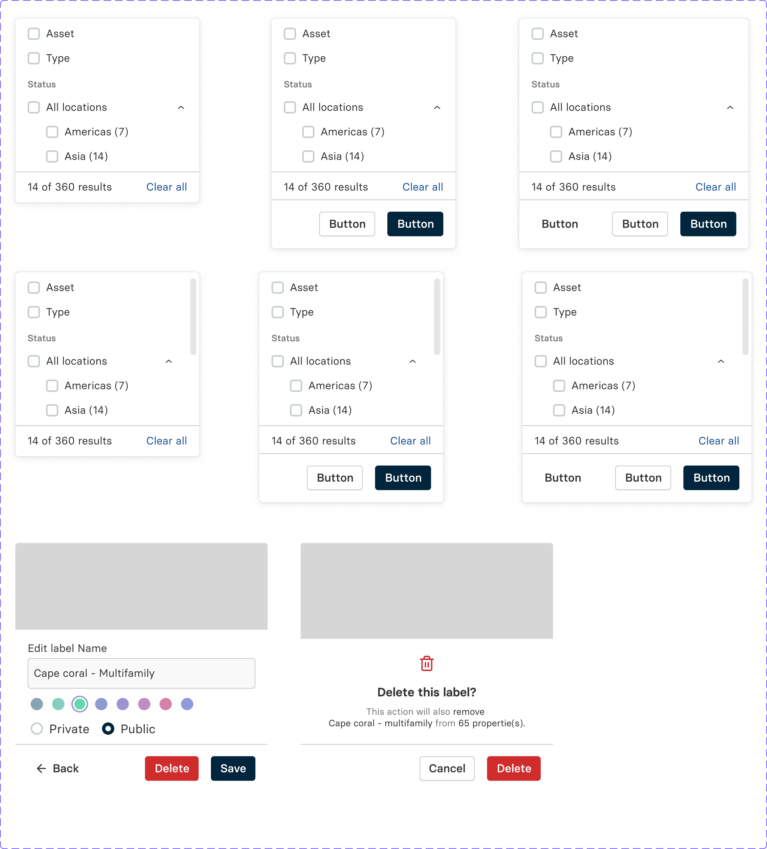
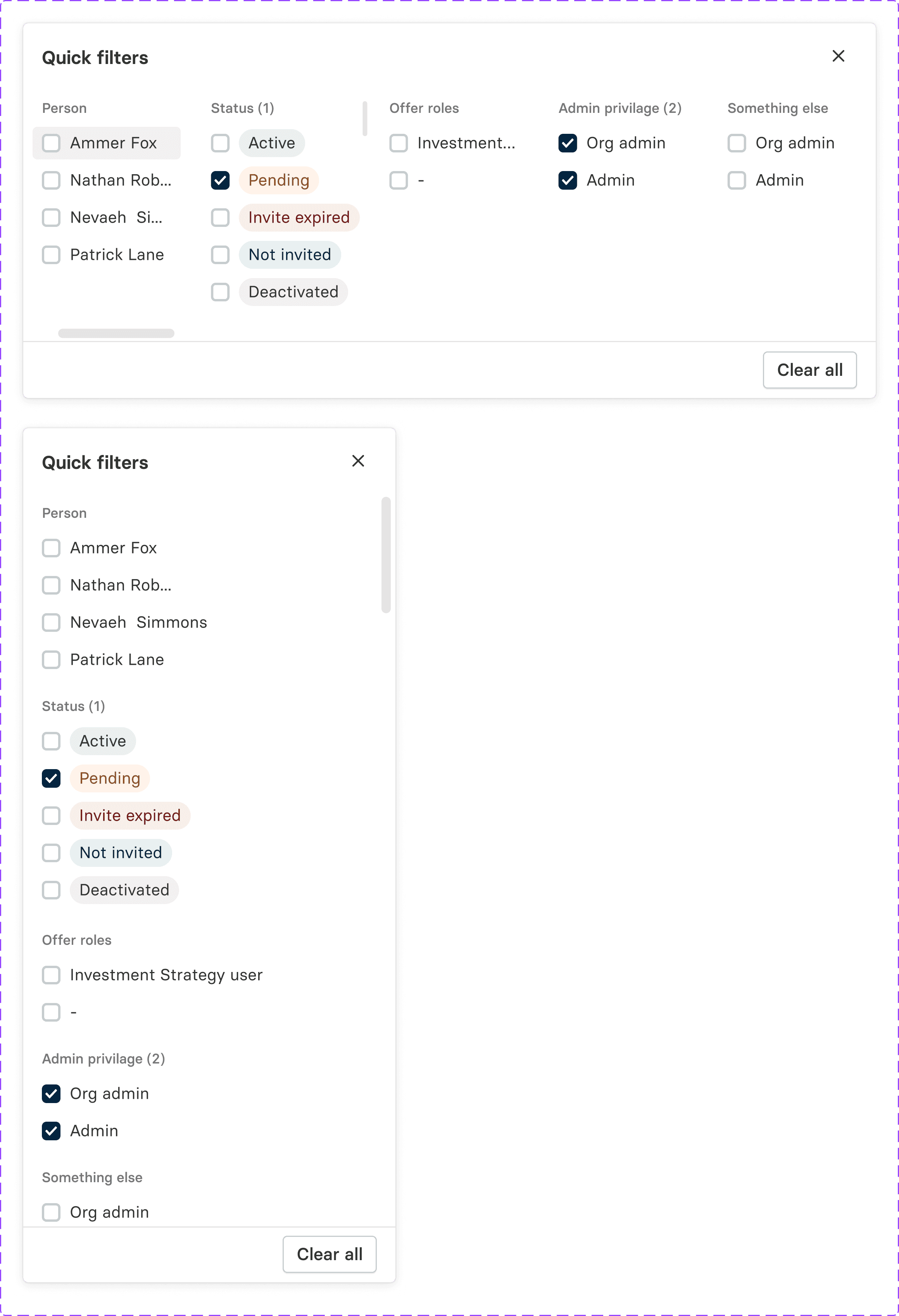
Page filters are UI components that allow users to refine content displayed on a page based on specific criteria, such as categories, dates, or ratings. They improve navigation and usability by helping users quickly find relevant information. Commonly found in e-commerce, search results, and data-heavy interfaces, filters make it easier to customize content views to individual preferences.
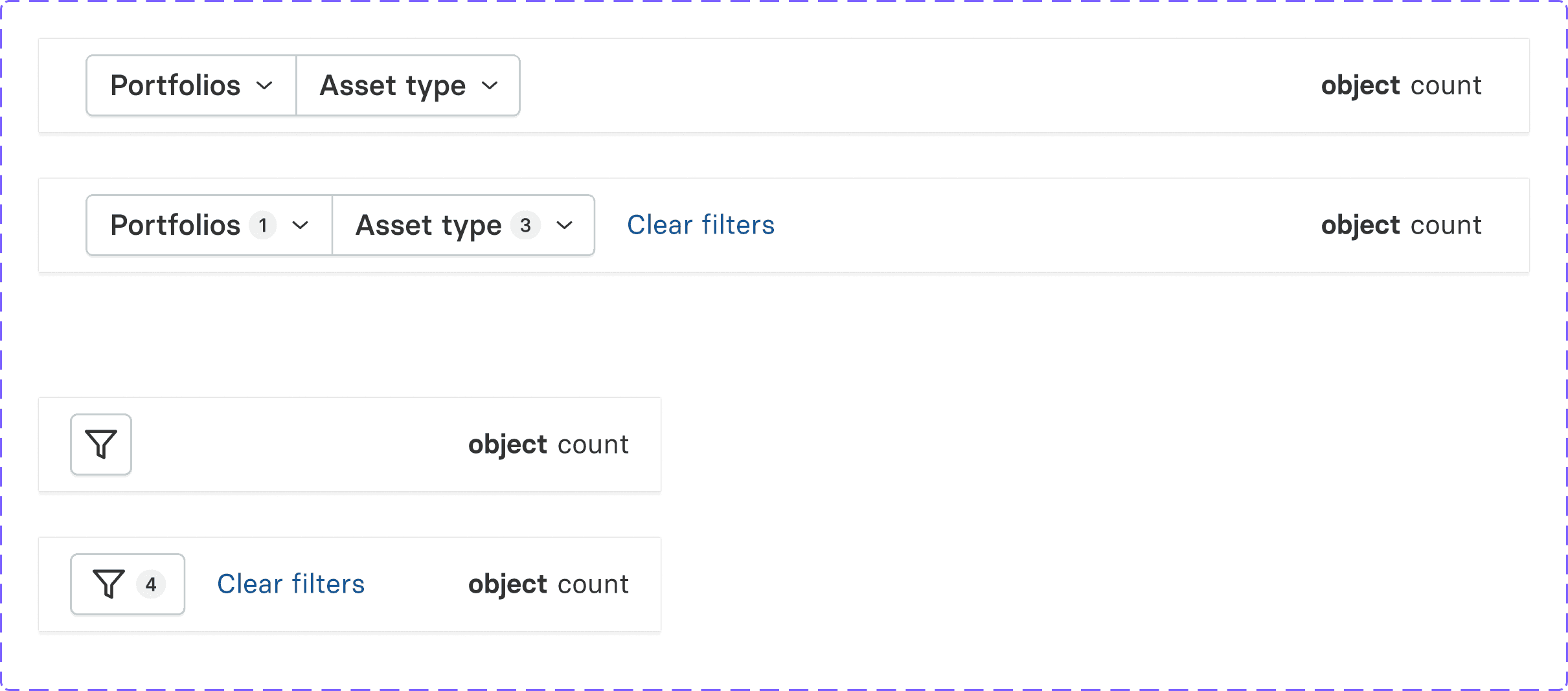
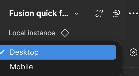
A "quick filter" typically refers to a user interface element that allows users to quickly narrow down content, search results, or options based on certain criteria. It helps enhance the user experience by making interactions more efficient and intuitive
Group Switch


Example
Color Palette
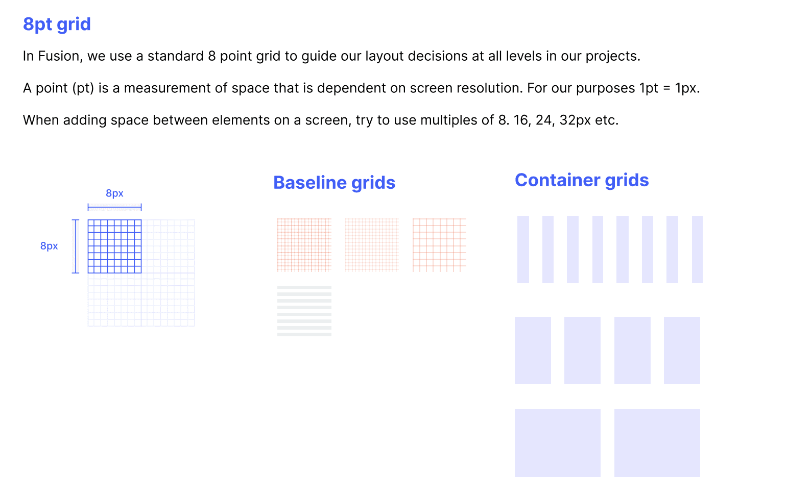
Grids & Spacing
System Icon Library
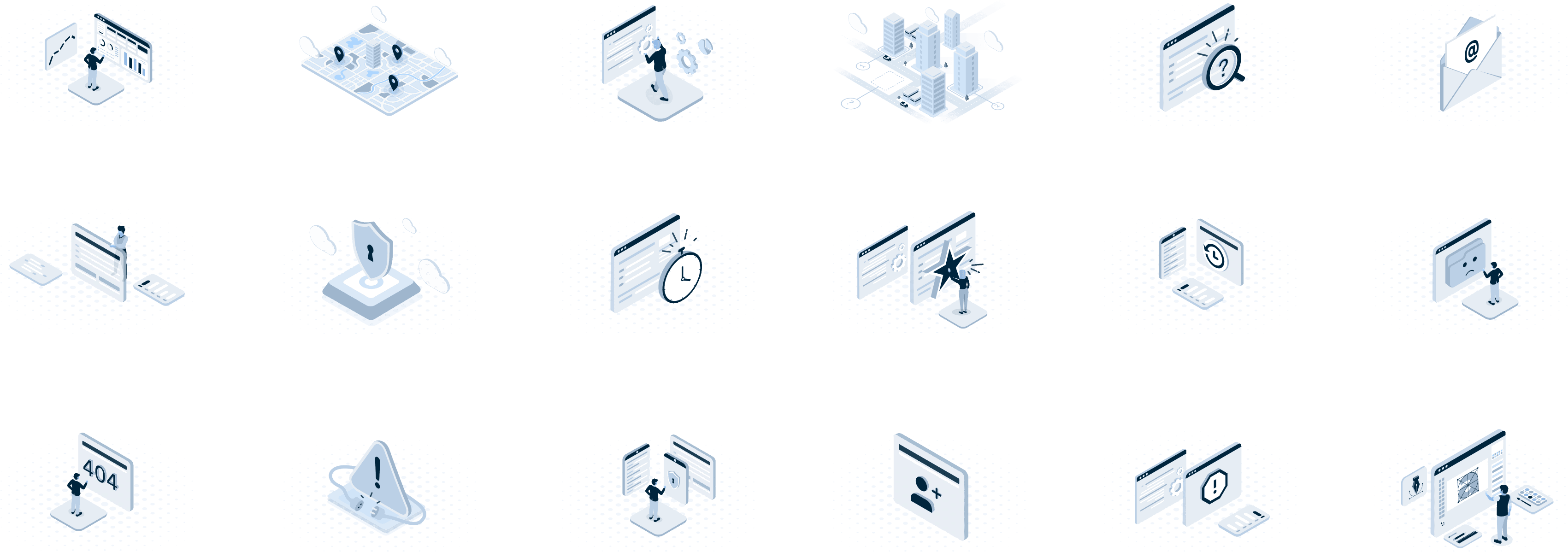
Illustrations
Typography
Accordin
System Alert
Avatar
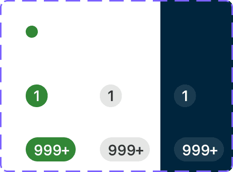
Badge
Paginator
Banner
Breadcrumb
Buttons
Button-Group
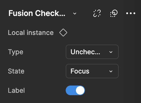
Check Box
Date Picker
Drawer
File Upload
Flyout
Model
Menu List
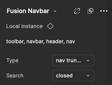
Nav Bar
Popover
Progress bar
Radio Button
Slider
Select
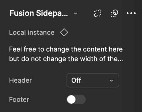
Sidepanel
Switch
Tab
Tag
Text area
Tooltip
Tooltip
Page Filters
Quick Filters
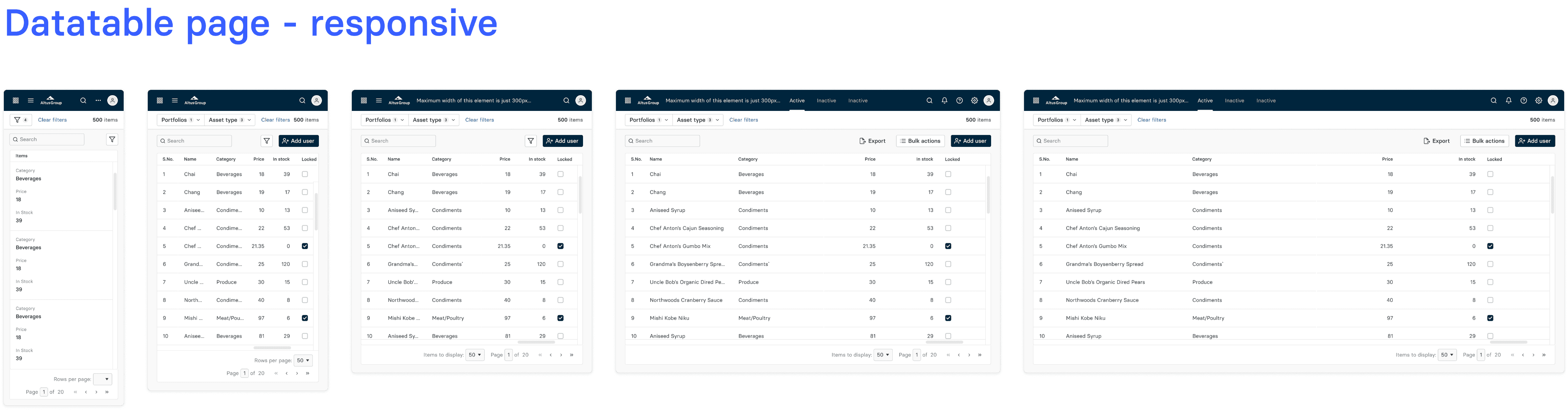
Data table - Responsive
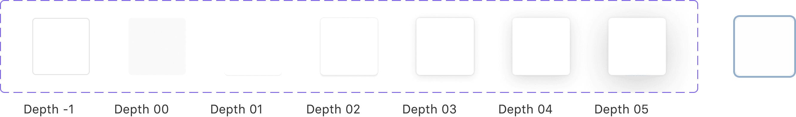
Elevation
Fusion Container component
Foucus
Examples
Spacing
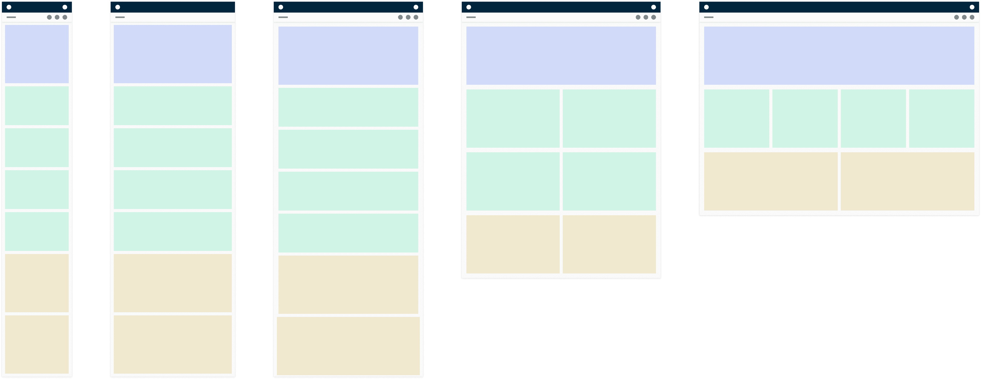
Responsive layout Example
Custom fusion icons

Regular Icons
360
640
768
1024
1440+


Foundation
A design system foundation includes core elements like color, fonts, spacing, grids, and icons. These basics help keep designs consistent and easy to scale across products. By setting a clear structure, teams can create cohesive, efficient interfaces that are simple to expand and adapt as needed.
Components
Components in a design system are reusable UI elements like buttons, forms, and cards that ensure visual and functional consistency. Built with guidelines for color, typography, and spacing, they streamline development, maintain brand identity, and enhance user experience.
Card layout Example
Fusion alert - Dismissible
Fusion alert - Bold
Example
Avatars
Examples
States


Examples
Dark Background


Primary
Secondary
Tertiary


Examples
Examples
Examples


Examples
Light Theme
Dark Theme


Patterns
Design patterns are reusable solutions for common UI/UX challenges, offering consistency and predictability. Examples include buttons, navigation bars, and form layouts. Patterns simplify the design process, enhance usability, and create familiar, intuitive experiences by providing users with recognizable interaction structures across applications.
Example
Thank you
FUSION
DESIGN SYSTEM
Vertical
Horizantal
Medium
Small
Extra Small
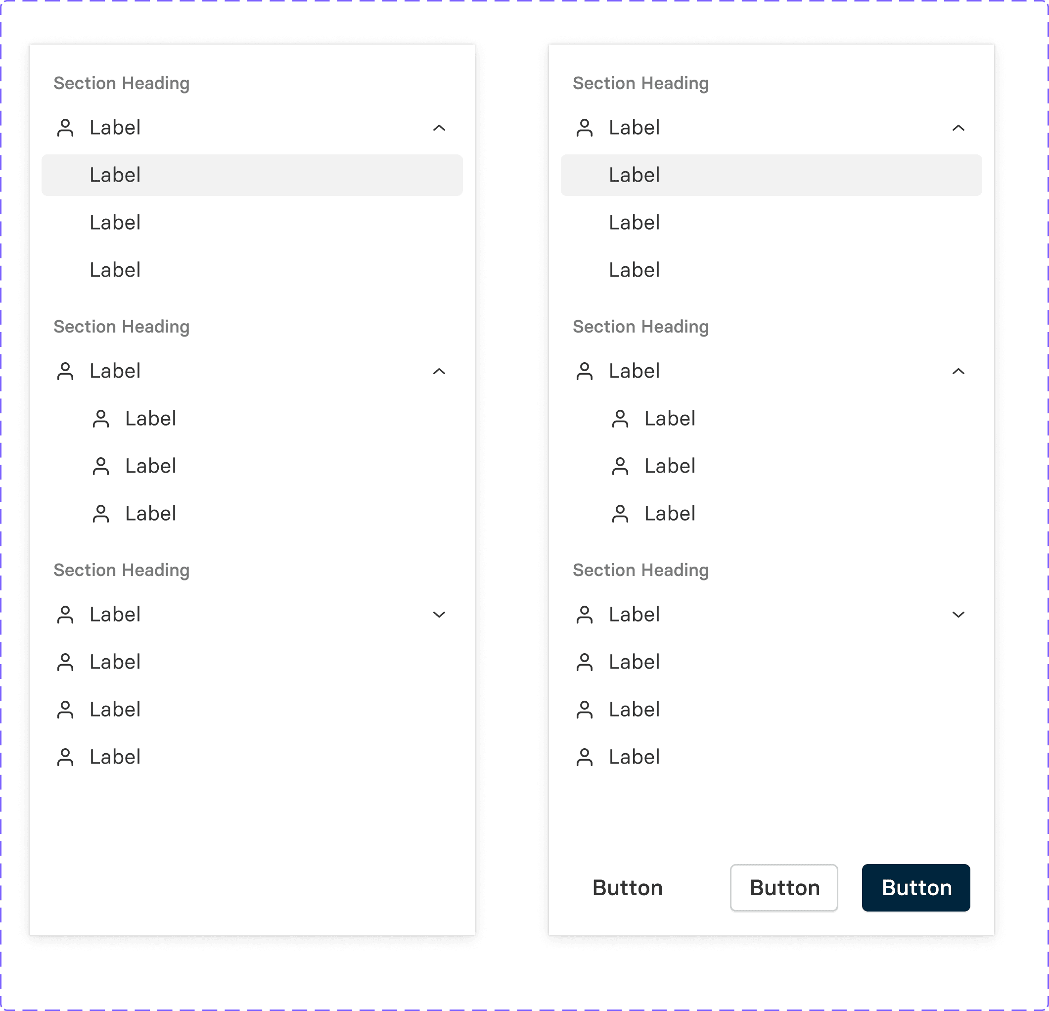
Our default variant contains an option-list component that can be changed/replaced based on what you need.